![](https://substackcdn.com/image/fetch/w_1456,c_limit,f_auto,q_auto:good,fl_progressive:steep/https%3A%2F%2Fsubstack-post-media.s3.amazonaws.com%2Fpublic%2Fimages%2F44caa513-1b00-40ef-94d5-8a5e0ede8fe4_3024x4032.jpeg)
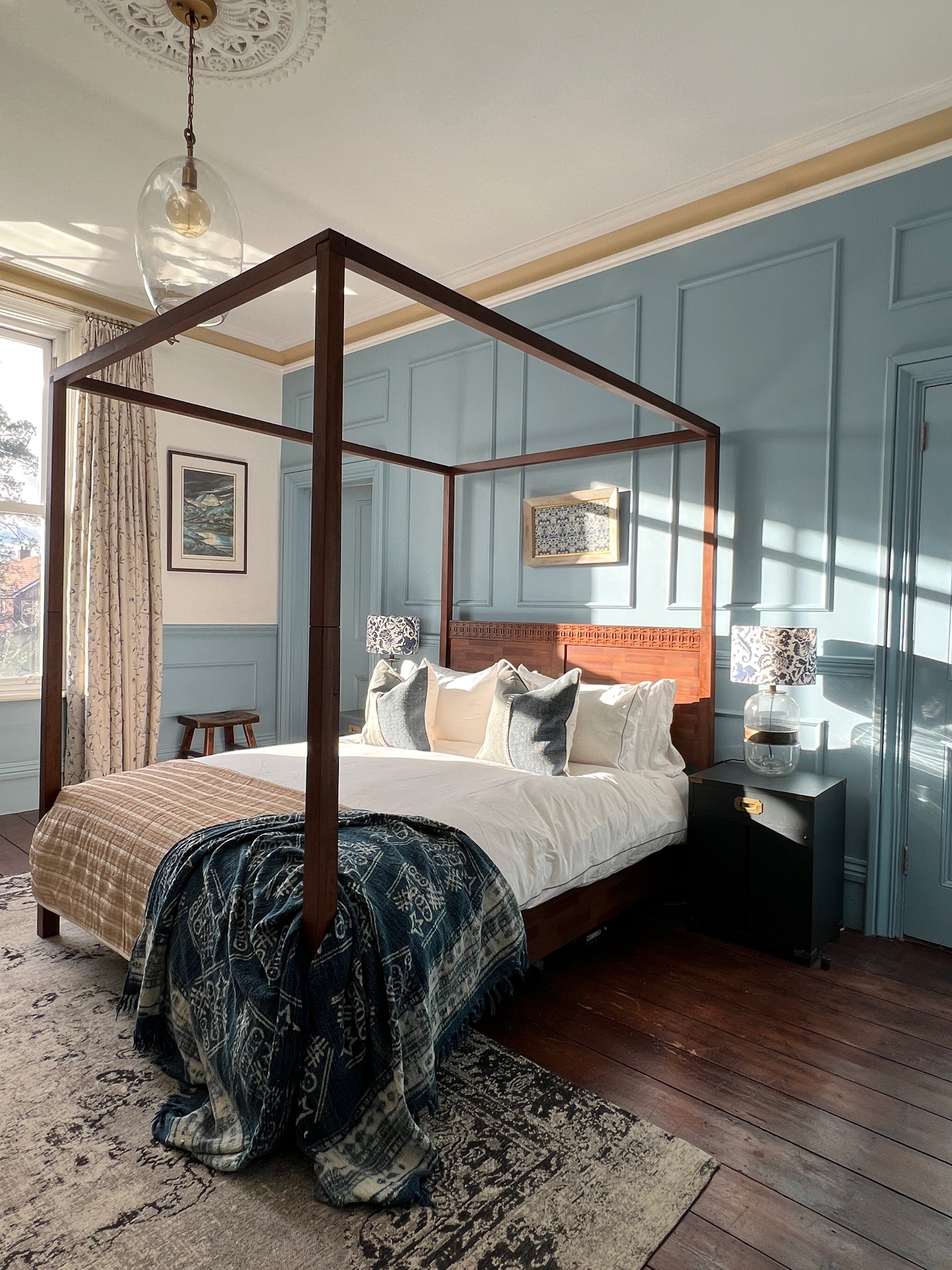
You can’t open an interiors magazine these days without being bombarded with blue. It’s the colour du jour and everyone’s talking about it, apparently. But, what’s so special about it all of a sudden?
I’ve never been a trendsetter and I have never really had a desire to follow them. Whenever I have bothered, I usually miss the boat and then I just end up looking decidedly uncool and slightly pathetic. For once though, I am ahead of the curve, like streets ahead!
That’s because Blue and white is not only my favourite colour combination, but it runs through me like a stick of Brighton rock. I’ve tried other colour combinations, but I’m always drawn back to the colours of a warm summer day by the sea.
I’m currently on our annual pilgrimage to Key west and the natural blues of this beautiful world could not be more blue. So, I thought it was appropriate to show you why I use the dreamy oceanic colour so much!
By the way, look out this week for a video trip to the Key West Martello Tower Gardens!
The colour blue, if used incorrectly, can feel cold and uninviting. I’ve used the palette in every house we’ve owned and learned over the years that it’s about mixing it with rich warm vintage woods, natural objects and soulful pieces that you’ve collected over the years. Blue in interior design can be uplifting, fresh and calming and can remind you of holidays in the sun. Here’s how I have used it in our home and how you can create a space with a sense of calm, breezy serenity.
When you travel to the Cornwall coast, or holiday in warmer climes by the ocean, there’s a certain kind of light. It’s brighter and fresher than it is back home. That warm sunlight affects the way colour is seen by the human eye. Blues never look cold in that radiant happy light. That’s what I try to achieve when I use the colour in design. I’m always thinking of the vacations we’ve had: summer on The Cape, a week in Santorini, or Easter in Key West. I try to fill our home with objects from these trips, mixed with warm blue hues and a white that is reminiscent of sunshine bouncing off rustic bleached weatherboard. Think balmy days lazing with a lemonade cooler.
![](https://substackcdn.com/image/fetch/w_474,c_limit,f_auto,q_auto:good,fl_progressive:steep/https%3A%2F%2Fsubstack-post-media.s3.amazonaws.com%2Fpublic%2Fimages%2F23c2ec39-7414-464e-9bcd-9ad6ddab87c1_4032x3024.jpeg)
![](https://substackcdn.com/image/fetch/w_474,c_limit,f_auto,q_auto:good,fl_progressive:steep/https%3A%2F%2Fsubstack-post-media.s3.amazonaws.com%2Fpublic%2Fimages%2F6b552cc6-7ebf-41a2-b9ab-495a430debd9_4032x3024.jpeg)
![](https://substackcdn.com/image/fetch/w_474,c_limit,f_auto,q_auto:good,fl_progressive:steep/https%3A%2F%2Fsubstack-post-media.s3.amazonaws.com%2Fpublic%2Fimages%2F9401d787-fd30-4abd-b793-17ef8698ca40_4032x3024.jpeg)
The shade of blue you choose for a space is hugely influenced by the light that it receives. In a south or west facing room I believe almost any blue can work, but I do know a lot of designers opt for a hue that has a purple undertone. By contrast, in a space that is north-facing, it’s generally better to go for a blue that has a green undertone to warm the space up. Northerly light already has a cool blue tinge to it, so it’s important to not choose a tone that makes it even colder.
A lot of people consider blue to be a chilly colour full stop. But that’s not true. When you think of the turquoise blue of the Aegean Sea, or the cerulean of a Mediterranean sky, do those thoughts make you shiver? No and why don’t they? Because they have green undertones and remind you of swimming in warm clear waters below a cloudless sky. That’s where my groove is. It’s all about creating the happiness of summer.
Blue in the master suite.
It’s definitely what I have tried to create in our master bedroom, albeit with a slightly grander Hamptons vibe. It was a master bedroom of huge proportions and high ceilings, but devoid of any original features, apart from the marble fireplace. I designed, fitted and decorated this whole room by myself. This room really demonstrates my casual Hamptons style, but adapted to suit the more formal details of our Victorian home. I wanted it to be timeless, with a mix of old pieces and new, without relying on trends. It was important to me that the space felt like it belonged with the rest of the house and, therefore steeped in history. I also wanted to celebrate the height of the room with something clever and make a statement with the enormous window looking onto the garden. It’s a south west facing room and with such a picture window, I wanted to make sure that the room was linked to the outside.
![](https://substackcdn.com/image/fetch/w_474,c_limit,f_auto,q_auto:good,fl_progressive:steep/https%3A%2F%2Fsubstack-post-media.s3.amazonaws.com%2Fpublic%2Fimages%2F4b78302a-2ef6-4c95-bca2-7b7d2007c8a0_4032x3024.jpeg)
![](https://substackcdn.com/image/fetch/w_474,c_limit,f_auto,q_auto:good,fl_progressive:steep/https%3A%2F%2Fsubstack-post-media.s3.amazonaws.com%2Fpublic%2Fimages%2F5f1232f4-a6f3-4bb7-a0a5-2e24140445b8_4032x3024.jpeg)
![](https://substackcdn.com/image/fetch/w_474,c_limit,f_auto,q_auto:good,fl_progressive:steep/https%3A%2F%2Fsubstack-post-media.s3.amazonaws.com%2Fpublic%2Fimages%2Fc03b2081-e0b6-4773-b090-0dd767ec666e_4032x3024.jpeg)
The powdery blue I have used here is called Pompadour, named after the infamous Madame De Pompadour and it’s by Craig and Rose. I decided to colour drench (a technique used for creating unity, calm and simplicity) the panelling that I built, incorporating doors, skirtings and architraves. By making the backdrop all one colour, it acts as a confident, but friendly canvas for the star of the show, the four poster.
How I Begin The Design Process
I always start every design with one or two items that I love and know will look perfect in the space. I’m not one for throwing everything out and starting again every time. To me, a home is made up of objects you have collected over a lifetime. Those objects hold fond memories, which give a home its character and depth. It’s these memories that are the key to creating a warm, cosy, loved environment. A space that is shared with friends and family.
My starter item could be an old pot I found in a thrift store, a chair that screams “love me!”, or a painting I found in Old Town Hastings, which I love because of the chipped perfectly imperfect gold frame. Usually, that one item will give me the overall air of the space I want to create. It will also give me a good idea of the main colour palette for the room.
This room started with a framed original piece of blue and white patterned fabric by William Morris. This would form the backbone and starting point for my design.
How the design progressed.
All the other rooms in the house have original ornate cornices and ceiling roses. I found a very inexpensive traditional plaster moulding guy who was able to take a sample of our original pieces and then replicate them, so that the master bedroom would look like the rest of the house. You would never ever know now that those mouldings weren't original. There is a concave curve within the cornice, which I decided to pick out by painting it in a soft gold oatmeal called Deep Sung Cream, which brings more warmth to the blue. I was cursing myself for doing it half way through, as it was incredibly hard to do three metres up in the air, but so worth it. The white I used is a bright, fresh white called Marble Dust, also by Craig & Rose.
I chose a dark wood four poster bed with ornate carved detailing from Olivias. This would showcase the height of the space and draw your eye to the ceiling and the cornice picked out in the soft gold oatmeal.
These colours were then repeated with oatmeal and white pure linen bedding, denim blue and beige cushions with rustic stitching detail and a soft gold throw and an indigo throw. The curtains are a pale beige linen fabric with cornflower blue embroidered flowers. This linked the three meter high curtains to the blue of the panelling to create a cohesive look.
I then made two lampshades using a kit and some old IKEA curtains I found in a cupboard. They were white with a large deep blue floral pattern and I knew the fabric would be perfect. I shopped my home for the lamp bases, which were glass and tarnished brass.
I re-used our vintage bedside tables painted in Railings by Farrow and Ball (a deep black-blue) for the two lamps to sit on either side of the bed, again creating symmetry. The William Morris framed fabric takes centre stage on the wall above the bed.
![](https://substackcdn.com/image/fetch/w_474,c_limit,f_auto,q_auto:good,fl_progressive:steep/https%3A%2F%2Fsubstack-post-media.s3.amazonaws.com%2Fpublic%2Fimages%2F4c274863-0865-4db2-9e95-76b538024349_1024x1015.jpeg)
![](https://substackcdn.com/image/fetch/w_474,c_limit,f_auto,q_auto:good,fl_progressive:steep/https%3A%2F%2Fsubstack-post-media.s3.amazonaws.com%2Fpublic%2Fimages%2F5a95ee42-0615-48a5-a223-fafe71ae89a1_1125x1121.png)
![](https://substackcdn.com/image/fetch/w_474,c_limit,f_auto,q_auto:good,fl_progressive:steep/https%3A%2F%2Fsubstack-post-media.s3.amazonaws.com%2Fpublic%2Fimages%2Fae2f26a9-01fc-4bc1-a0cb-b0bbefd5b852_3024x3024.jpeg)
Green based blues are the key.
Some of my favourite blues that will work in almost any light are:
Oval Room Blue - Farrow and Ball
Swedish Blue - Craig and Rose
Brighton - Little Greene
Inchyra Blue - Farrow and Ball
Blue Ground - Farrow and Ball
Hague Blue - Farrow and Ball
Borrowed Light - Farrow and Ball
![](https://substackcdn.com/image/fetch/w_474,c_limit,f_auto,q_auto:good,fl_progressive:steep/https%3A%2F%2Fsubstack-post-media.s3.amazonaws.com%2Fpublic%2Fimages%2F2234edf6-5a4a-43c9-ab9c-bfd0366259ea_1124x1122.png)
![](https://substackcdn.com/image/fetch/w_474,c_limit,f_auto,q_auto:good,fl_progressive:steep/https%3A%2F%2Fsubstack-post-media.s3.amazonaws.com%2Fpublic%2Fimages%2F8d058c27-5c78-4586-9132-0d3201a880c7_4000x2668.jpeg)
![](https://substackcdn.com/image/fetch/w_474,c_limit,f_auto,q_auto:good,fl_progressive:steep/https%3A%2F%2Fsubstack-post-media.s3.amazonaws.com%2Fpublic%2Fimages%2Fca11320e-417a-436a-ba14-233e4bfec83e_1125x1119.png)
Sometimes all you need is an accessory or two in a blue shade to give an airy sense of relaxed beach style to a space. In the middle photo, our previous master bedroom, I only used an indigo throw and two bedside tables painted in Railings by Farrow and Ball to bring a coastal feel to the room. The rest was made up of soft whites and rustic natural tones. You might also notice that the throw and the bedside tables are used again in our current bedroom (main photo), but in a very different way.
Our drawing room
My two definite starter pieces for the drawing room were things we had bought years ago. A set of vintage blue bobbins mounted on a dark wood stand that I bought from a gallery. The other object was the very tip of a mounted church steeple in faded white. It came from a visit to our beloved Key West and was from an old church that had been torn down years ago. So, I have my colour palette. I have two vintage objects that hold memories. I can now base the rest of my design on these two things. The turquoise blue of the chandelier added a third complimentary colour, which I can pick up in some of the paintwork.
Buying a period property comes with quite a lot of responsibility in my mind, as we are only the custodians of it for the time that we call it home. The Drawing Room (I know that sounds grand, but it really is a “Drawing Room”) is one of the most ornate rooms in our house and deserves some special treatment.
![](https://substackcdn.com/image/fetch/w_474,c_limit,f_auto,q_auto:good,fl_progressive:steep/https%3A%2F%2Fsubstack-post-media.s3.amazonaws.com%2Fpublic%2Fimages%2Fca1a99ec-0c01-460f-a97a-d0a75cf20762_4032x3024.jpeg)
![](https://substackcdn.com/image/fetch/w_474,c_limit,f_auto,q_auto:good,fl_progressive:steep/https%3A%2F%2Fsubstack-post-media.s3.amazonaws.com%2Fpublic%2Fimages%2Fc9ced019-1efe-414a-94fe-46b2790c4997_4032x3024.jpeg)
![](https://substackcdn.com/image/fetch/w_474,c_limit,f_auto,q_auto:good,fl_progressive:steep/https%3A%2F%2Fsubstack-post-media.s3.amazonaws.com%2Fpublic%2Fimages%2F90a64dc5-597c-4e6d-83d7-8d09da010e3b_4032x3024.jpeg)
An antique vert de gris coloured chandelier is the first thing we bought for this space. I was keen to make sure that the room did not become too “bling”. So, for the rest of the space I wanted to mix my love of old and new with my passion for blue and white. I wanted to create a homage to the period, whilst keeping it contemporary and cosy at the same time. It has a kind of “Downton” meets “Hamptons” vibe.
The blues
I chose Railings, a very dark blue for the ceiling. I then picked up the paler blue-green of the chandelier with a stripe of Swedish Blue surrounding the night sky ceiling.
I’m sorry, did you just say dark blue ceiling?
I darn well did and it works a treat! We have very high ceilings and the room felt cold and draughty. By painting it in a dark tone, it brings the ceiling down towards you and immediately gives you a midnight blue hug. I know it’s an unusual choice, but do consider it if you have a high ceiling. I chose not to paint the cornices or the original ceiling rose in the dark blue. That way, they popped being so close to such a contrasting shade. There’s an edged moulding that frames the dark blue centre, then a gap of about eight centimetres and then the ceiling cornice. The Swedish Blue was used in this gap to accentuate the chandelier and complement the dark blue.
The overall effect is a slightly grand coastal room with a heavy nod to the Victorian Gothic period, but with an air of Hamptons seaside charm. At least, that’s what I hope it looks like. Becca, from @malmoandmoss, one of my favourite blogs and Instagram accounts, said to me a while back: “You always manage to make every room look like you’re on holiday.” She doesn’t know it, but that’s one of the loveliest things she could have ever said to me. Job done!
Gorgeous JP, love your drawing room especially the little horse. Xxx
So beautiful JP. I’m torn between whether I love your bedroom or the Drawing Room more! (Though I have a huge weakness for the blue ceiling in your garden canopy!). You’ve created cohesion too across the house, which isn’t easy in a grande dame like yours!