A Victorian renovation - The Kitchen.
How we came up with an unusual kitchen design for our home and fitted it ourselves to save money.
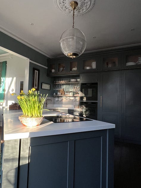
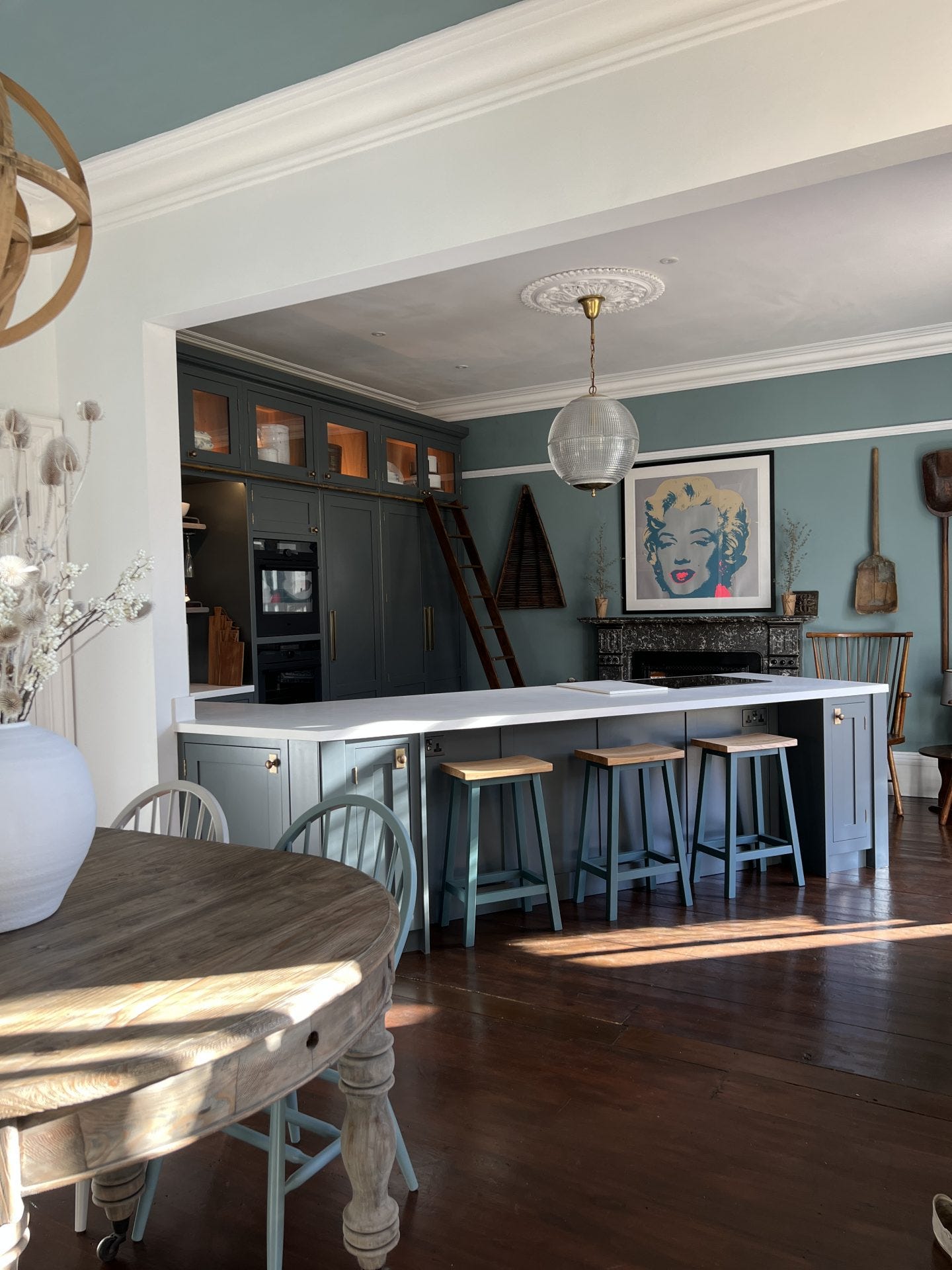
We always knew that converting a Victorian Gothic dining room into a kitchen was going to be a challenge. Particularly as it had an enormous original marble fireplace right smack in the middle of it. Designing a kitchen with only one fully useful wall proved more difficult than we expected too, even after years of designing and fitting kitchens in our previous homes (nine so far!). That’s why we created a triangular kitchen with a diagonal peninsula. It’s a bit out there, I know, but it works like a dream! If you are about to embark on your new kitchen journey, then continue reading to find out how we overcame a lot of the obstacles. Even in the most unusual of spaces, you too can design a kitchen that you can be proud of.
In the last 26 years (yes, 26 of them!) since my husband, Mr C and I got together, we have designed countless kitchens. We’ve learnt on the job, making mistakes along the way. With every project we have gained more knowledge. We now know what makes a great kitchen, be it large or small. We understand what works and what doesn’t, what to avoid and how to save money. We’re in no way professionals, it was a case of needs must really, as finances wouldn’t allow for expensive contractors. For the last three kitchens we have used Classic Kitchens Direct for all our units. I believe they are now known as The Painted Kitchen Company. Can’t recommend them enough by the way! For this kitchen I even built their new flat packed range and I fitted them myself.


The original dining room
It was a beautiful room even before we started any renovations. We thank the victorians for that. However, it was extremely tired and needed a huge amount of love. It’s attached to a slightly smaller room, which would have been the original Victorian kitchen. The wall between the two had been knocked down by the previous owner to make it open plan. Our first idea, before the triangular kitchen solution, was to keep the smaller space as the kitchen.
However, we moved the entrance to it so that you can see the garden beyond from the front door. That meant that the smaller space was more of a walk-way with a lot of traffic. That’s my biggest design tip ever, by the way. If it’s at all possible, try and make sure you can see the outside and all the way through your home from the front door. It’s the best way to make it inviting, bring the outside in and create a flow through your home to the garden beyond.
Read on to find out how we got around all the architectural obstacles and came up with our final design. There will be more posts coming up soon in which I show you how to design a kitchen and save money. If you’re currently a free subscriber, or you’ve just stumbled on my little space on here, you can get full access to this post and the upcoming series by upgrading to a paid membership. You’ll also get access to my archive, audio recordings, planned tours for 2024, be able to comment and join this wonderful, friendly community.


