The Design History of the Pride Flag
And why I think it’s time to embrace the original flag and its true meaning.
Welcome to HOME & HORT, the place where we chat about home and garden renovation, design & enjoyment, with a little bit of life, love and fun thrown in for good measure. Come and join our merry gang from 88 countries around the world and 48 U.S states.
Every now and again I feel I need to step away from home and garden shenanigans and talk about life. Today is one of those days. This is a FREE post as it’s so important, most are for paid members.
This post could be too long for email, due to images, so you may need to read it in the app, or online.
It’s Pride Month and the flags are out. In fact, in the UK they are absolutely everywhere, it’s impossible to miss. You can’t do your weekly shop without noticing the rainbow of colour. I love it! 18-year-old me, marching in solidarity with thousands of others in central London, just to be allowed the same rights as everyone else, could never have dreamt of such mainstream acceptance.
But, at the time of writing (Friday 20th June) the usual flags flying high above Regent Street in London are yet to be hoisted. The Crown Estate, which owns most of the property there, lodged plans to raise the flags between mid-June and mid-July in support of Pride events. Now, Westminster Council faces possible legal action from Christian Legal Centre, after approving the plans.
It says the new Progress Pride flags create division by excluding more traditional values of sex and gender, referring to the acknowledgement of transgender people within the flags. It says the flags should not be allowed to ensure “everyone feels welcome.” The irony is quite astonishing. Whether they fly as they should this weekend through to London Pride on 5th July and beyond is yet to be seen.
In a time where LGBTQ+ rights are being eroded or removed entirely in many parts of the world, where the 12 local councils controlled by Reform UK, have banned the Pride Flag being flown from council buildings, it is more important than ever to fight for equality and raise the flag. But, is it the right flag?
The original 1978 motif was designed to include everyone, one human family, and its purpose was the furthest thing from division. So, is it time to revert back to the true meaning of Pride and remain strong with a powerhouse of a design?
I’m currently residing in a ‘safe place’ somewhere deep in the West Sussex countryside, preparing myself for the barrage of complaints and protestations at what I am about to write:
THE LATEST REINCARNATION OF THE PRIDE FLAG IS A HOT MESS!
Just my humble opinion, but before you start frantically typing away about inclusivity and progress, perhaps hear me out first?
I’m a 54-year-old married gay man. I grew up in a world where being gay was illegal. I was there during the AIDS crisis and lost loved ones. I was there during the introduction of Section 28, a law prohibiting the promotion of homosexuality as “normal” within schools. I was there when the World Health Organisation declassified homosexuality as a mental illness in 1992. I’ve also had to lie, betraying myself and my beliefs, by declaring I wasn’t gay or that I’d had an HIV test, in order to get my first mortgage. I have done my marching and I have fought long and hard to be able to be the openly gay man that I am today.
I believe in equality for all, regardless of your sexuality, gender, race, or creed. I am in no way decrying any member of the LGBTQ+ community. The world is big enough for all of us. But, I do think that the Progress Pride flag is not necessary. I do believe it’s divisive, and as a symbol of solidarity, I also think it’s downright ugly and far too busy!
To explain why, here’s a short history of the design of the Pride flag:
The Original Rainbow Flag
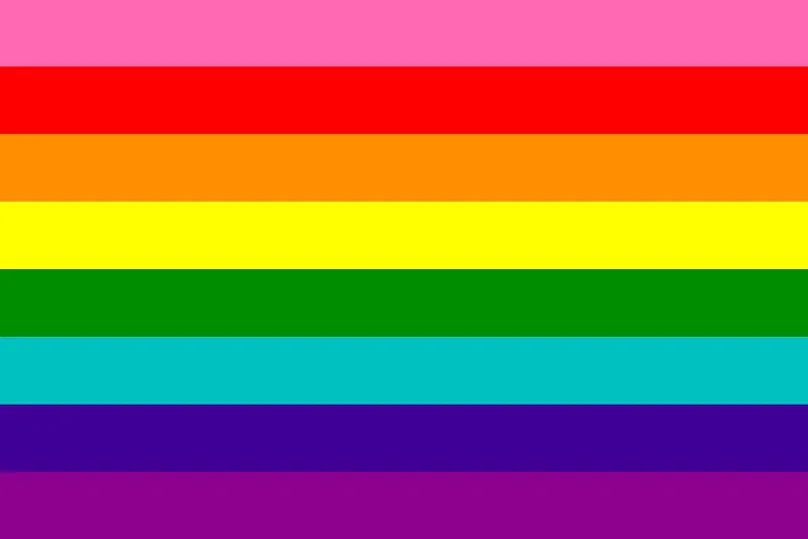
The first rainbow flag was designed in 1977 by San Francisco artist Gilbert Baker, an openly gay man and drag queen. Friends, Artie Bressan and Harvey Milk, the first openly gay elected official in California, had asked him to create a symbol of pride for the gay community.
At a show at the Winterland Ballroom, Baker watched a diverse crowd dance around him. At that moment an idea came to him: “Dance fused us, magical and cleansing. We were all in a swirl of colour and light. It was like a rainbow,” he said.
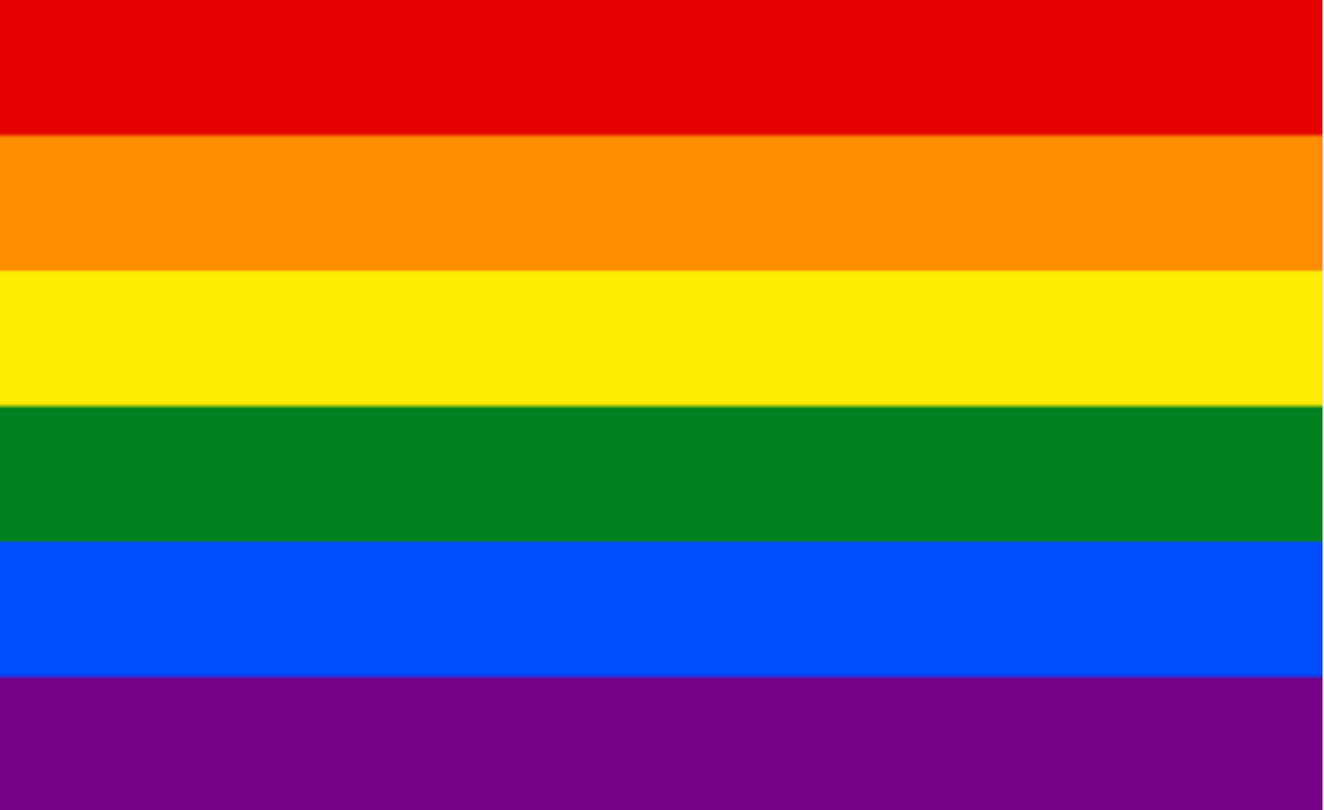
He envisaged the rainbow as a natural flag from the sky, so he adopted eight colours for the stripes. Each colour had its own meaning:
Do you see any mention of sexual identity, gender, race, colour, nationality or religion there? No. That’s because the rainbow already included every human being on this planet. The colours were never ever meant to represent different groups of society, by doing so, surely someone would be left out? There aren’t enough colours in the world to signify every type of person.
Instead, they represent elements of human life as well as the symbolism of the colour spectrum. Gilbert Baker created the design for “all genders, all races, all ages, the rainbow of humanity.” It was designed specifically to be inclusive.
In my opinion, the creation of the other elements in the Progress Pride flag completely negates that meaning and the meaning of inclusivity. Now we are faced with in-fighting and many other groups asking why they have been left out. Where is the representation for bisexual people, for example? The entire community has got so caught up in saying: ‘what about me?’, that they have totally missed the point. In doing so, they have bastardised the beautifully simple flag that represented them all in the first place.
The problem is that there is no global governing body for Pride or the flag, so it seems almost anyone can chip in. I’ve always said that good design never ever happens via committee. Something I remind my husband of constantly. As an ex-marketing and PR, it’s a huge mistake and it’s high time that one international body was responsible for our legacy.
The six colour flag
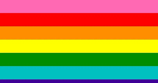
After the assassination of Harvey Milk in November 1978, demand for the rainbow flag hugely increased. The Paramount Flag Company, whom Baker worked for, began selling a version using stock rainbow fabric with seven stripes: red, orange, yellow, green, turquoise, blue, and violet. He cut the pink stripe because fabric in that colour was in short supply at the time. In 1979 he dropped the turquoise stripe, combining it with indigo to create royal blue. The result was the six-stripe version that most people still recognise today as the Pride flag.
Greater inclusion?
As time has moved on, some groups have argued for changes to the six colour flag motif, asking for more inclusivity and a supposedly better representation of the LGBTQ+ community, another initialism that seems to be getting longer and longer. It’s probably why the word ‘queer’ (as much as I hate it due to its historical derogatory use toward gay men) has now been adopted by many, as it’s a darn sight easier to say and includes everyone.
In 2017, the city of Philadelphia added two stripes to the six-stripe design to highlight the struggles of ‘queer’ people of colour. The new black and brown stripes were placed at the top of the flag. While many argued that the addition was divisive, the design was soon taken up by other cities around the world. Notice that in theory, diversity and inclusivity were now part of the meaning of the flag.
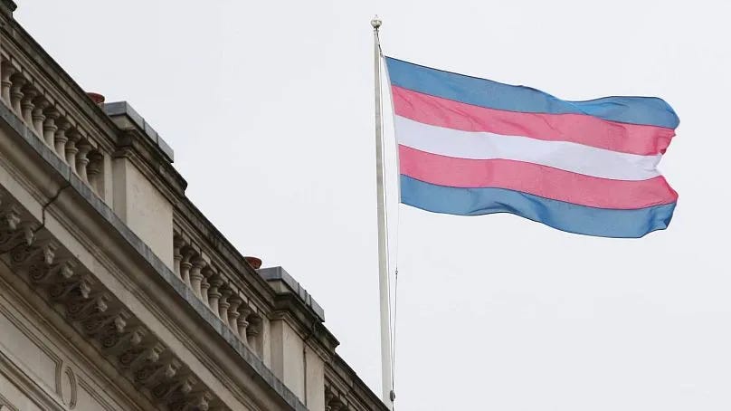
Over time more flags were designed to highlight the struggles of other communities. In 1999, Monica Helms created the Transgender flag, made up of five light blue, pink and white stripes.
The Progress Pride Flag
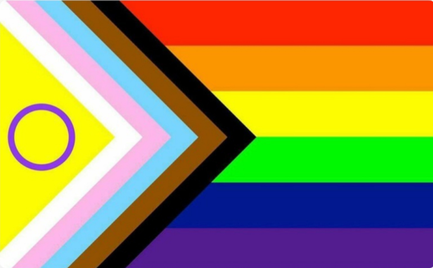
After the popularity of the Philadelphia version, designer Daniel Quasar created the Progress Pride flag in 2018, that incorporated the transgender flag colours, as well as the new brown and black colours, with brown representing people of colour and black highlighting those affected by HIV and AIDS.
I fully understand the need to feel included and represented. At this very moment trans rights are being swept from society and it’s very important that the support and camaraderie is there. But, in design terms, the flag is messy and not easy to replicate. A rainbow is so much simpler, and I believe it already covered every minority. It’s why it was adopted on a worldwide scale and even got its own emoji. The rainbow was accepted and celebrated, and then we went and ruined it all by continually adding to it and confusing everyone.
Controversially, Quasar's version is licensed and excludes commercial use without payment. This has been hugely criticised as not being in keeping with Baker's intent for the flag. He refused to trademark the original, seeing it as a symbol for the whole of the LGBTQ+ community and should be free.
In 2021, Valentino Vecchiette, the founder of Intersex Equality Rights UK, added the purple circle on yellow background to incorporate the voices of intersex people (someone born with sex characteristics that are not exclusively associated with a singular binary definition of male or female).
This is where I kind of lost the plot on the Pride flag in design terms. Now it is just an overcomplicated shadow of its former self. How do you project this onto the face of The Whitehouse, as was done with the rainbow flag in 2015 to commemorate the legalisation of same sex marriage? To promote a cause and to get a message across effectively and decisively, it needs to be simple.
Conclusion
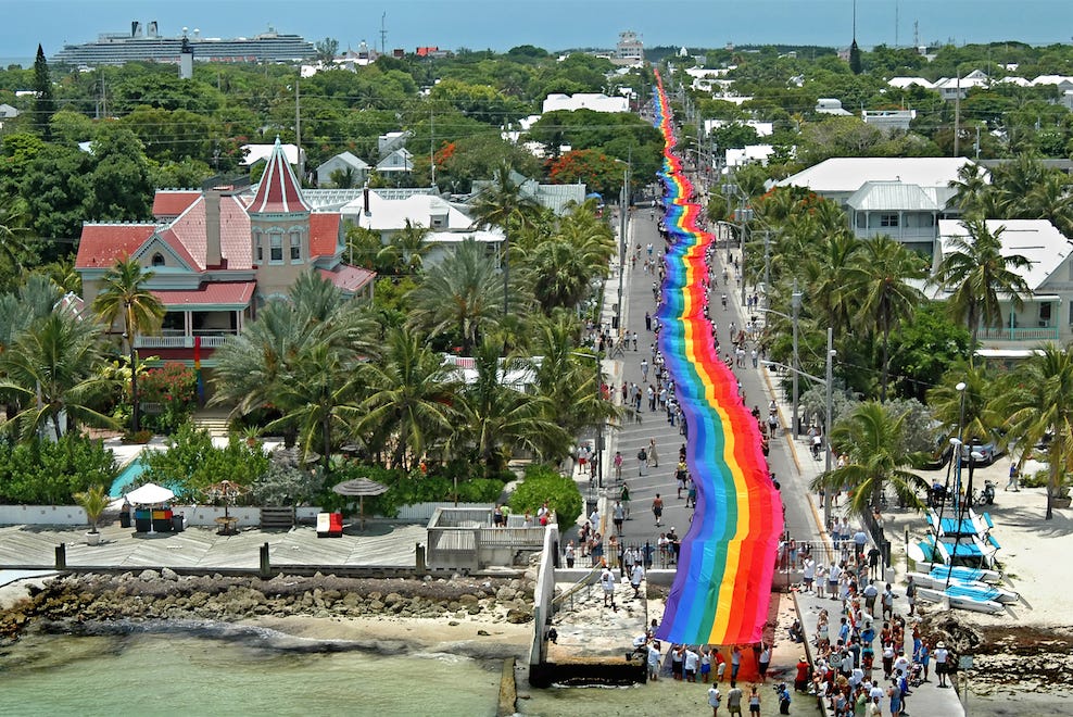
In 2003, to commemorate the Rainbow Flag's 25th anniversary, Baker recreated the original Rainbow Flag stretching some 1.25 miles from the Gulf of Mexico to the Atlantic Ocean down Duval Street in Key West.
Afterwards he sent sections of this flag to more than 100 cities around the globe. A sign, I believe, that the inclusive principles of a beautiful rainbow were enough to represent all people in this world.
The reason the rainbow flag has been embraced by LGBTQ+ people all over the world is because it does not represent specific races, sexual orientations, gender identities, or nationalities. It is a universal symbol of acceptance and love in all its forms.
I believe it’s time to honour Gilbert Baker, and all those before us that fought for equality. I think it’s time we rejoiced in the original design, the one that didn’t worry about whether pink fabric was available.
I think some of the original meanings of the colours could be combined. Sexuality and Life go together in my mind, and Harmony and Spirituality could also be melded, leaving room for some of the other colours to represent Diversity and Inclusivity of all people.
We can’t keep adding to the design. Believe me, there are still groups that feel excluded. There always will be. What’s next? Imagine adding to the Stars and Stripes or the Union Jack? They’re iconic and so was the rainbow flag. We destroyed our very best advertisement.
In the 21st century, I’m not sure a continual barrage of ‘difference’ or frantically drumming the beat of a militant queer drum is the right answer. Maybe it’s time we changed tack and reminded people of the many things we have in common? What better way to do that than with a flag that includes everyone?
Right, I’m running for cover. You’ll find me in the garden somewhere over the rainbow.
I’d love it if you could leave a little heart ♥️ and a comment. If you really want to melt my butter then Restack it (that’s the recycle symbol below) as well. It get’s this post out to new lovely people.









So well said!!! Beautifully written & hits the nail squarely on the head. We are seeing this in so much activism these days - the well-meaning abortion bill going through parliament at the moment will achieve very little change, as we are already in a very good place except for extremely rare circumstances, but it will galvanise the far right & ultimately harm the women it’s aiming to protect. We need to move the discourse on these complex issue away from a focus difference & polarisation & towards inclusivity & acceptance. You do this perfectly in this post. Bravo!!! 👏
Just… yes. Yes to all of this. Also I had no idea of the history of the design and I love that nature is represented. The rainbow in nature - sunlight through rain - always seemed a very appropriate symbol.