Does the Colour of the Year actually matter?
…and quite frankly my dear should we give a damn?
This is a paid subscriber post. You can read a preview of it below though, or you can upgrade to read the whole thing. You can cancel any time. The next free newsletter will be next week.
I’ve never been a huge follower of trends. I tend to base my choices on timeless classics, horticultural eccentricities and the comforting certainty of the ebb and flow of the tides.
I like what I like. I make no apologies for my colour choices. It’s absolutely no secret that my favourite palette is blue and white and every possible marine and tropospheric hue in between. Although, in the last few years, perhaps because of my age, my environment, the pandemic, or just sheer boredom, I’ve been quite smitten by the botanical allure of all things green too. But, who cares? Why should the world be concerned about what my favourite colour is, or yours for that matter? Why should anyone want to influence, or change our minds?
Pantone’s colour system is the most important colour matching process in the world. It originated in 1963 to solve the complicated problem of colour matching in the print industry. It soon became the most widely used way to match and classify colours. Every single tint and tone of every shade in the world was given a number. Quite an incredible feat when you come to think about it!
Every year just before the jolly festive season in December, the Pantone Color Institute (why, oh why can’t we have the same spelling?) announces their next colour of the year. Big brands, designers, fashionistas, creators and the social media glitterati (I do not count myself amongst them, just so you know) wait with anticipation. So much so they can barely breath.
Apparently, there are even sweepstakes for what the new hue might be! Hundreds of brands take on the task of designing products with the new esteemed colour. The institute takes into consideration all aspects of society including fashion, politics, horticulture, religion, gender and social media. It even looks at the general zeitgeist of the world around us and how the new colour should help and inform us of how to move forward in the year ahead.
To get in on the act, most big brand paint companies around the globe now also have their own Colour of the Year. As if one wasn’t enough! They often announce it before Pantone’s colour, which is a tad sneaky, but if I were a paint company I think I’d follow suit. In fact, it’s getting earlier and earlier. Benjamin Moore announces in October. Dulux now begin their fanfare in September! Give it a few more years and they’ll all be doing it inline with the Easter bunny, mark my words!
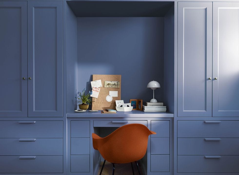
The other day a complimentary tester pot of paint landed on my doorstep. Benjamin Moore Paints had sent me their new Colour of the Year for 2024: Blue Nova. It’s a mid-tone blue with just the right amount of red in it to give it warmth and depth. It supposedly represents the night sky just after the sun goes down.
It’s a shade that agrees with me immensely and so my immediate thought was that I wanted to promote it and tell you all how wonderful it was. But, all morning something was bugging me. What if I hadn’t liked it as is often the case?
That really got me thinking. Do I need to be told what the colour of the year is? More importantly, do I need to tell you? Do I really give a rat’s arse how they came about their decision and will it have any effect whatsoever on my life? Well, you’d be surprised!
Why not considering upgrading to read the whole article? This newsletter is a reader supported publication.


